2021
Coinbase Referrals
This is a redesign of Coinbase’s referrals experience. Our goal was to increase referral conversion, as well as referred first buys (number of referred users who complete their first trade).
Impact: +4% referred first buys


Start trading on Coinbase using this link and get $10 in Bitcoin
coinbase.com/join/chen_d76
Get $10 in Bitcoin
Limitations apply
Sign up for Coinbase using my link and we can each get $10 in Bitcoin.

Tobias
iMessage


Signup page refresh
As a first step to redesigning referrals, we wanted to look at how we could deliver low-cost optimizations in order to reduce customer support tickets and increase conversion for referral signups.
In addition to making stylistic changes to the signup page, my main priorities were to:
Remove the app up-sell banner at the top because we were taking people away from the main job to be done
Make sure the signup form was visible above the fold, especially on smaller devices


coinbase.com
Password
I certify that I am 18 years of age or older, and I agree to the User Agreement and Privacy Policy.
Create account
You’re invited to try Coinbase!
You'll get $10 in free Bitcoin when you buy or sell $100 or more in crypto. Learn more
coinbase.com
Before
After (iPhone 8)
GraphQL for SMS invite
Since the current prepopulated message we provided was lengthy and hard to parse, I leveraged GraphQL to add a graphic to the SMS invite and partnered with Content to shorten the text copy.
This not only created a more visual and delightful experience, it also provided a better affordance for the invited user.

Start trading on Coinbase using this link and get $10 in Bitcoin
coinbase.com/join/chen_d76
Get $10 in Bitcoin
Limitations apply
Sign up for Coinbase using my link and we can each get $10 in Bitcoin.

Before
After
Visual considerations
We considered other graphics as well but ultimately went with the gift box illustration due to its ability to translate well across locales.
Get $10 in Bitcoin
Limitations apply
Get $10 in Bitcoin
Limitations apply

Get $10 in Bitcoin
Limitations apply
MVP framework
I started out with this intial framework where I added quick social share options in order to reduce friction when inviting. The social share options include popular messaging and social media platforms such as Twitter and WhatsApp.
Users can also see their top 3 most recent invites with the ability to see more. And for additional features such as invite contacts, there’s a sticky CTA at the bottom which will trigger a bottom sheet that will house these features.
User Research
We conducted 10 unmoderated sessions across North America, the EU, and Australia. This was a task-based prototype study where we asked users to invite a friend to join Coinbase and observed their process.
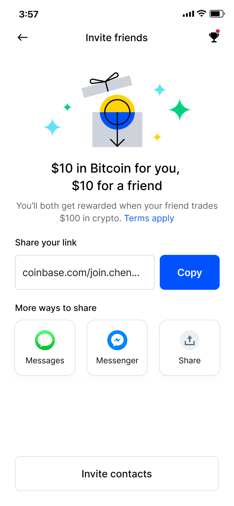
3:57
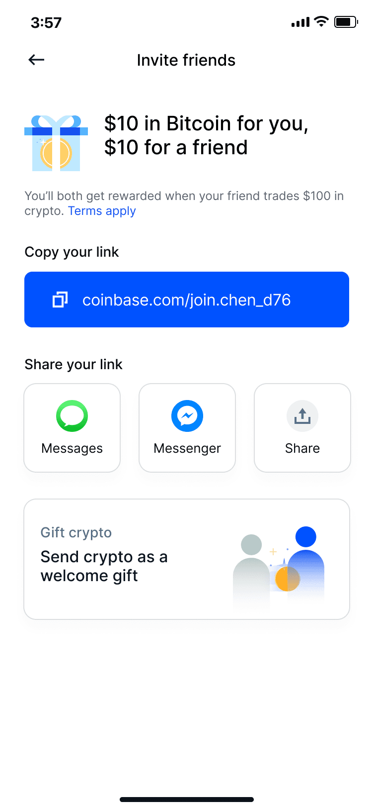
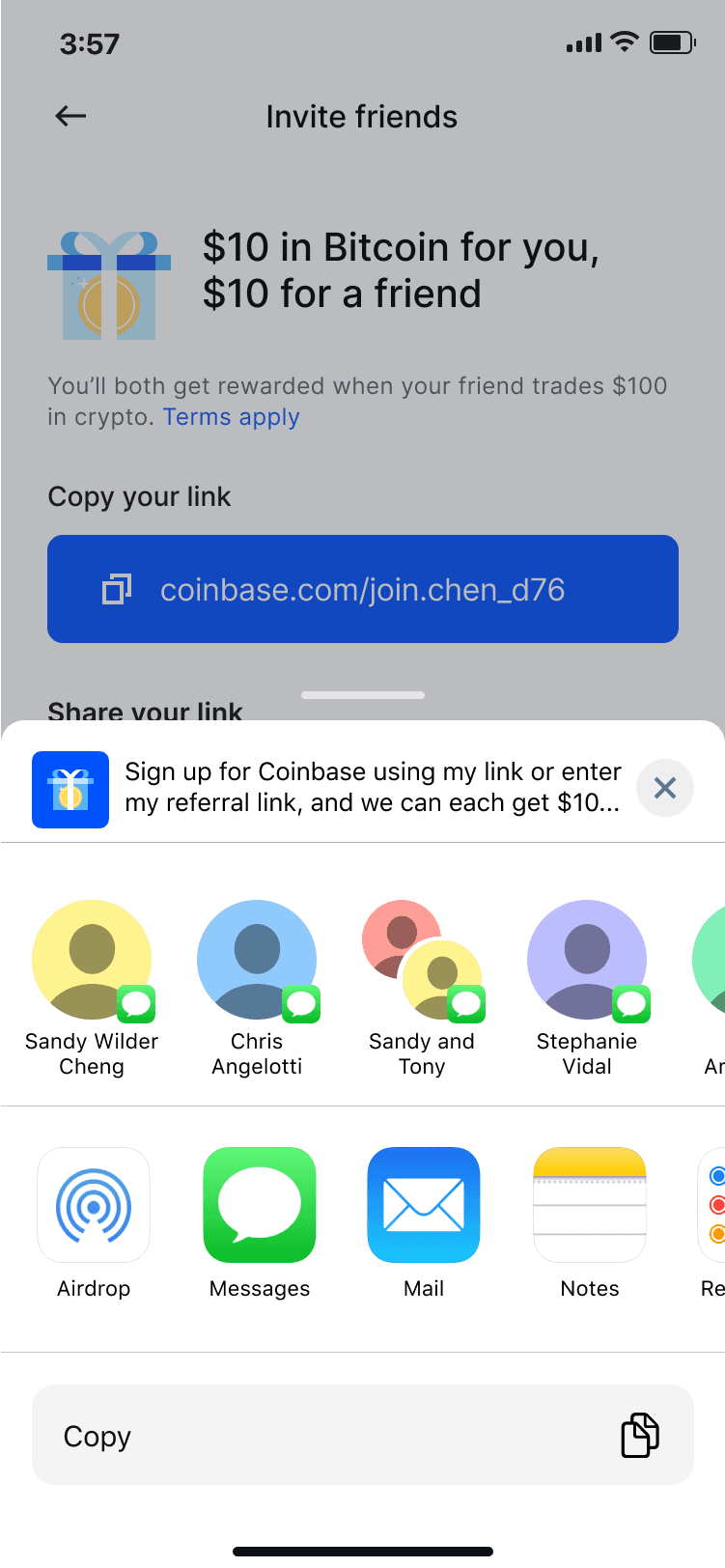
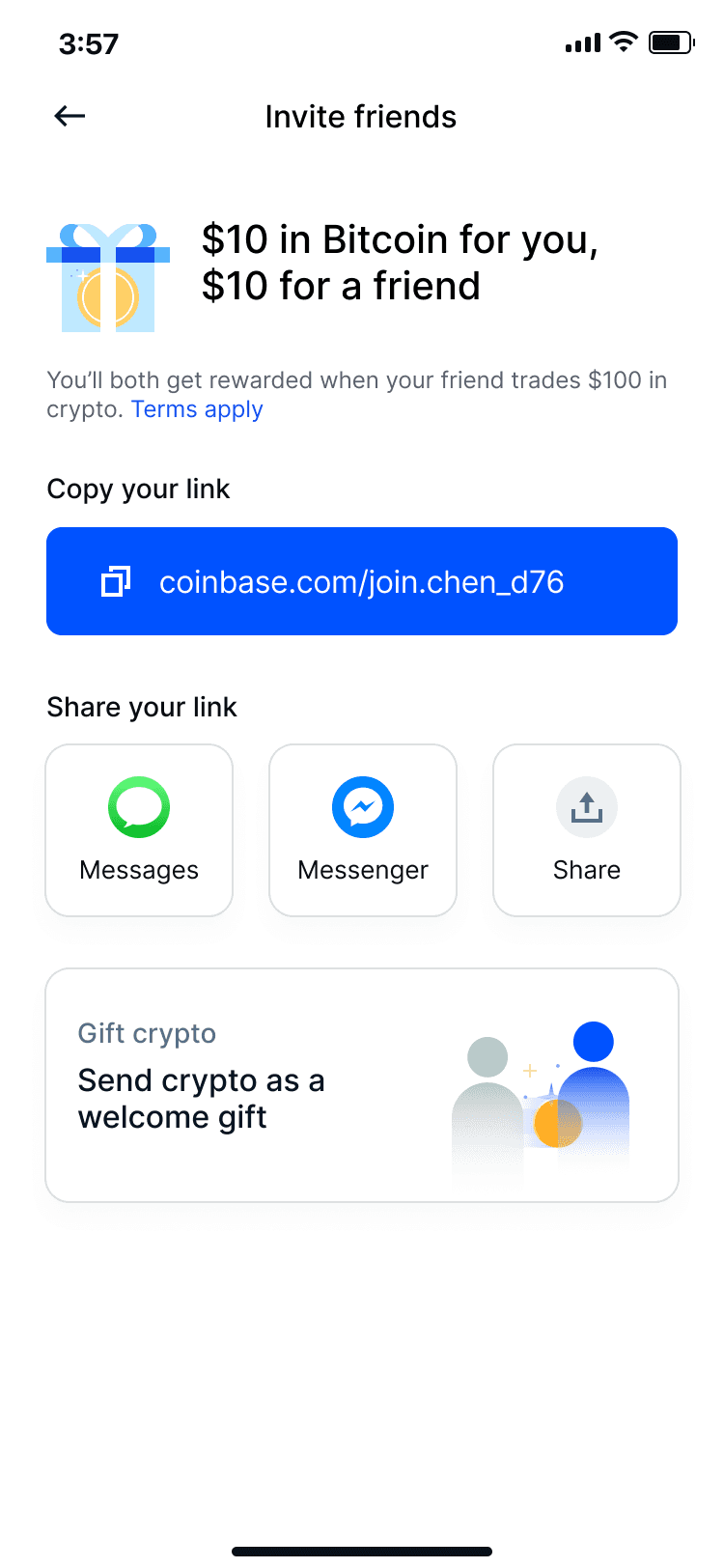
Invite friends
$10 in Bitcoin for you,
$10 for a friend
Share your code with a friend before they sign up and you’ll both get $10 in Bitcoin after they buy or sell $100 of crypto. Terms apply
Share your code
2XY61B
Copy
Share your link

Message


Messenger
Copy
More
Share
Past invites
Jill Chen
June 10, 2021
Wilter Lam
June 9, 2021
Emily Chan
+1 (415) 665-2523
See all
3:57
Invite friends
Find your friends
Let’s start by adding your contacts.
View contacts
$10 in Bitcoin for you,
$10 for a friend
Share your code with a friend before they sign up and you’ll both get $10 in Bitcoin after they buy or sell $100 of crypto. Terms apply
Share your code
2XY61B
Copy
Share your link
Message
Messenger
Copy
More
Share
Send crypto
Send crypto as a welcome gift
Invite friends
Add friends from your contacts
Send a reminder
Nudge a friend to sign up or trade
3:57
3:57
Invite contacts
Message preview
Sign up for Coinbase using my link or promo code, CCHEN1, and we can each get $10 in Bitcoin.
Name, phone, email or address
Suggested
Jill Chen
+1 (415) 676-8989
Invite
Wilter Lam
+1 (415) 665-8988
Invite
Emily Chan
+1 (415) 665-2523
Invite
Contacts
Aaron Smith
+1 (415) 676-8989
Invite
Adam Jones
+1 (415) 665-8988
Invite
Alan An
+1 (415) 665-2523
Invite
Amy Kim
+1 (415) 643-8986
Invite
Azi Zaheer
+1 (253) 665-3124
Invite
Benjamin Brown
+1 (241) 241-8988
Invite
Benny Lam
+1 (415) 676-8989
Invite
Cameron
+1 (415) 676-8989
Get $10
Cara
+1 (415) 676-8989
Get $10
Caroline
+1 (415) 676-8989
Get $10
3:57
Invite friends
Find your friends
Let’s start by adding your contacts.
View contacts
$10 in Bitcoin for you,
$10 for a friend
Share your code with a friend before they sign up and you’ll both get $10 in Bitcoin after they buy or sell $100 of crypto. Terms apply
Share your code
2XY61B
Copy
Share your link
Message
Messenger
Copy
More
Share
Send crypto
Send crypto as a welcome gift
Invite friends
Add friends from your contacts
Send a reminder
Nudge a friend to sign up or trade
3:57
3:57
Referral activity
First name, Last initial
Date
Status
$Reward if applicable
Reward
December 21, 2021
$20
Claimed
Jill Chen
December 12, 2021
Send reminder
Lily Yee
December 12, 2021
Send reminder
William Chung
December 05, 2021
Send reminder
Reward
December 21, 2021
$20
Claimed
Reward
December 21, 2021
$10
Claimed
Reward
December 21, 2021
$10
Claimed
Claimed
Pending
$120
Total referral reward
123
space
Label
P
O
I
U
Y
T
R
E
W
Q
L
K
J
H
G
F
D
S
A
M
N
B
V
C
X
Z
To:
Jill Chen
New Message
Cancel
Hey there! Just sending a friendly reminder to sign up for Coinbase so we can both get $10 in free Bitcoin. 😊
Finding 1
Personalized share options
Almost all participants wanted personalized sharing options.
EU & AUS: WhatsApp
US: Twitter/X, Instagram
Finding 2
Data privacy concerns
Even though it was easy for users to find and invite someone through the contact book, 1/3 participants had concerns around sharing that information with us.
MVP
Based on the findings, I iterated on the framework for our MVP experiment. I partnered with Content and Eng to shorten the terms copy, and build robust social share options that are localized based on the market the user is in to reduce friction.
Dedicated entry point
A timely change being implemented on the main consumer app was the addition of the "More" menu. This felt like the perfect home for Referrals because unlike other trade-related features, referrals is not a place that's trafficked often.

“More” menu in new architecture
MVP experiment
Due to timeline constraints, we defaulted back to referral links since back end wasn’t able to finish referral codes in time for this experiment.


Referral hub
Share sheet

Experiment result
After running the experiment for about a week, we saw a slight dip in metrics due to tracking issues, and little engagement on the referral link CTA. We had a few hypotheses as to why there was a dip in the metrics:
Having 1 CTA to copy referral link was likely an unfamiliar interaction pattern
Titles read as two steps you’d have to do one after another
Gifting team’s up-sell caused cognitive overload

Solution & Impact
We defaulted back to using a familiar affordance for copying the referral link, and partnered with Content Design to update the headlines to they read as two distinct steps. After making these changes and re-running the experiment, we saw +4.1% in referred signups, and +XX in referred first buys.
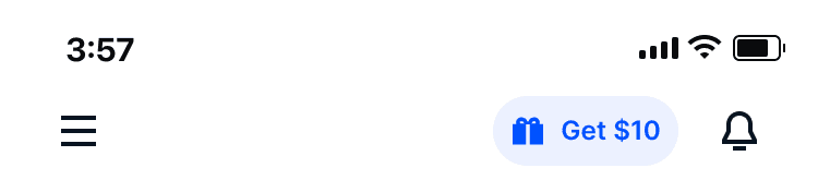
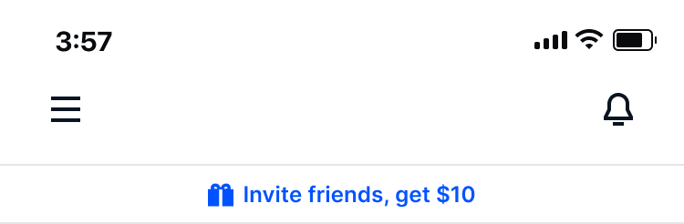
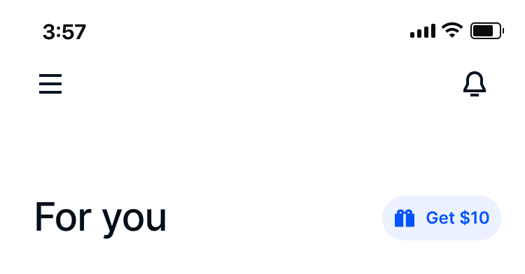
Global entry point
As a fast follow, leadership wanted a more prominent entry point to access referrals. I explored these three initial directions. We ultimately went with the version that’s next to the bell icon in the header.
Header (shipped)
Sticky banner
For You feed
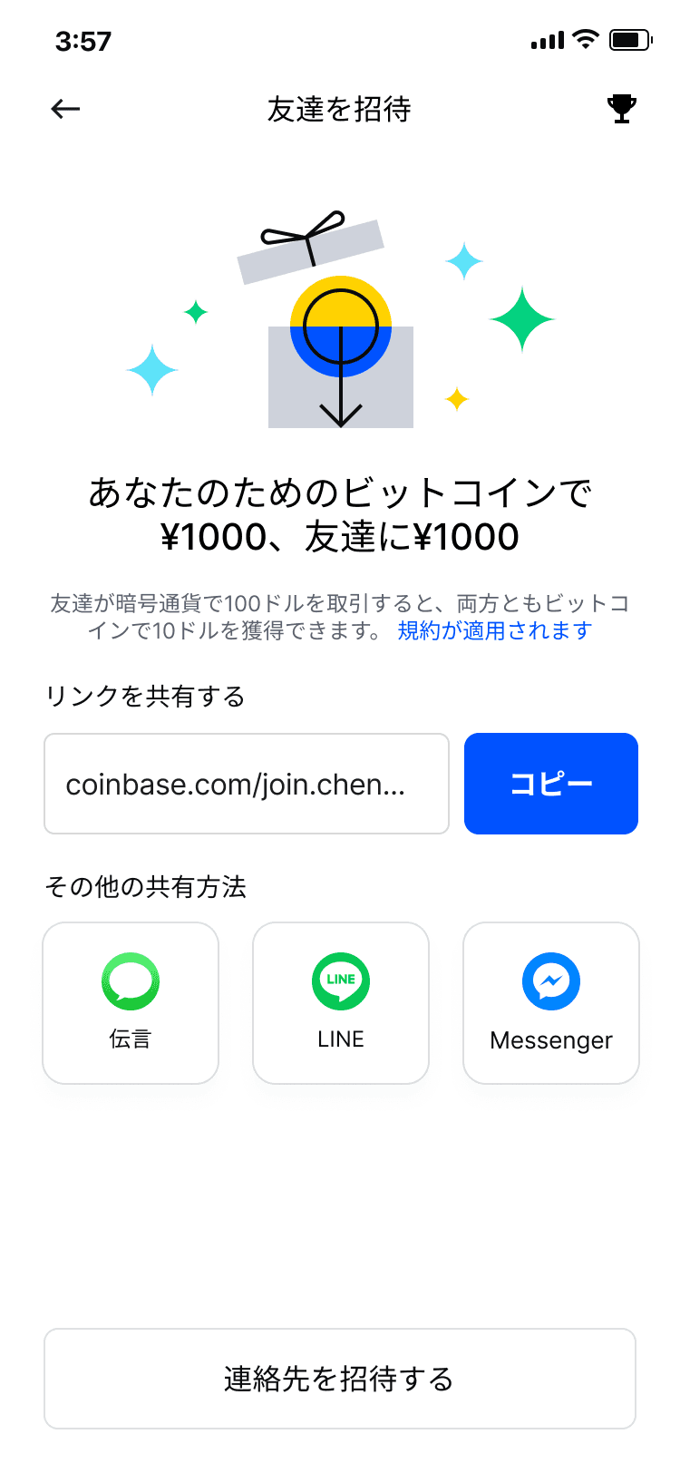
Updates & Localization
I updated the designs to leverage our new illustration library, and also worked with the localization team to roll out referrals for countries like Japan.